This article looks at how window pulls can be refined by using the selection tools in Photoshop and also luminosity masking.
This is the first in a series which will look at some of the techniques I like to employ when editing and retouching architectural and interiors images.
This is the first in a series which will look at some of the techniques I like to employ when editing and retouching architectural and interiors images.
As interiors photographers, we've probably all come up against the need to burn in over-exposed exterior views, also known as "window pulls", as the effect tends to bring the view closer somehow. One method of course is to shoot an exposure suited to the interior, which will include blown out windows, and then to make a mask of the window area to allow another darker or flash-filled exposure, better suited to the exterior view, to show through on its own image layer.
All well and good, but to really convince, I feel that similar but graded adjustments need to be applied to anything in the interior scene which might also be reflecting the exterior view. So think: table tops, kitchen worktops, polished floors etc. Whenever such surfaces in a standard interiors image are reflecting a very burned out exterior view, they will always appear a little odd, or "reversed out" when the exterior view only is pulled in. And items which are located very near the windows will also be of equivalent luminance to items in the landscape, so these too will need to be brought down in value.
So when an image requires quite a strong window-pull, I like to create independent masks of these additional areas which can employ varying amounts of the darker exposure so that they are better integrated with the scene. And these masks are created a little differently according to what is being selected.
Sure: this method involves one more step but I feel it is the key to producing natural looking window pulls which avoid an obviously composited look. When I carry out a window-pull for clients, it will always include consideration of how it works with the complete scene.
Please have a look at the example image below: please click on the image to get a larger version with captions.

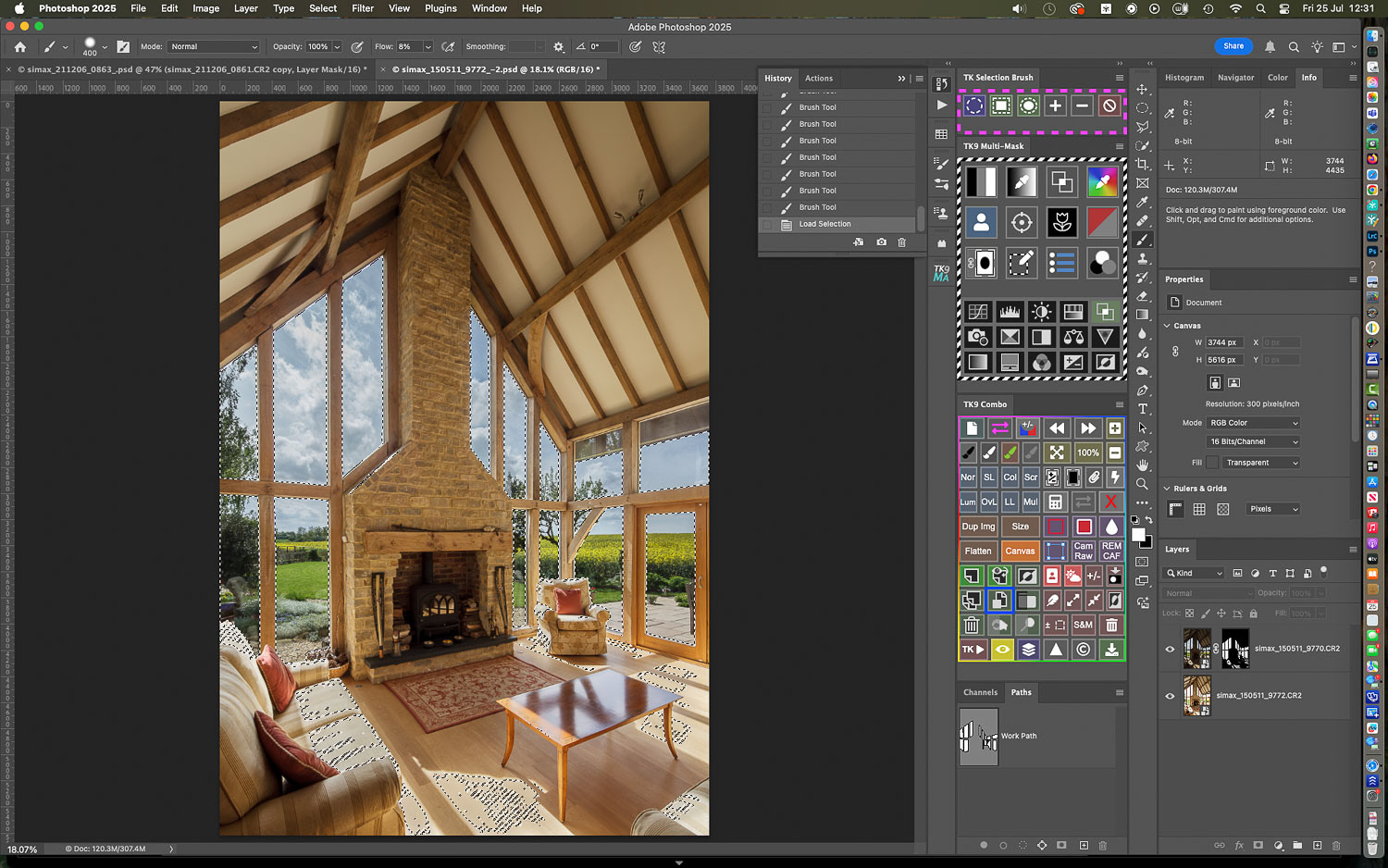
The usual starting point : a well exposed interior but the view is over-exposed...

Shooting a separate frame to suit the exterior ...
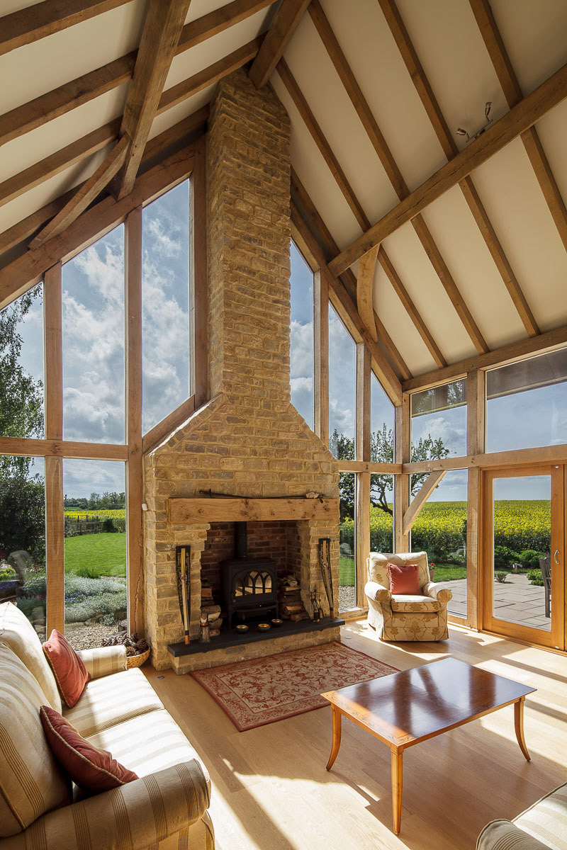
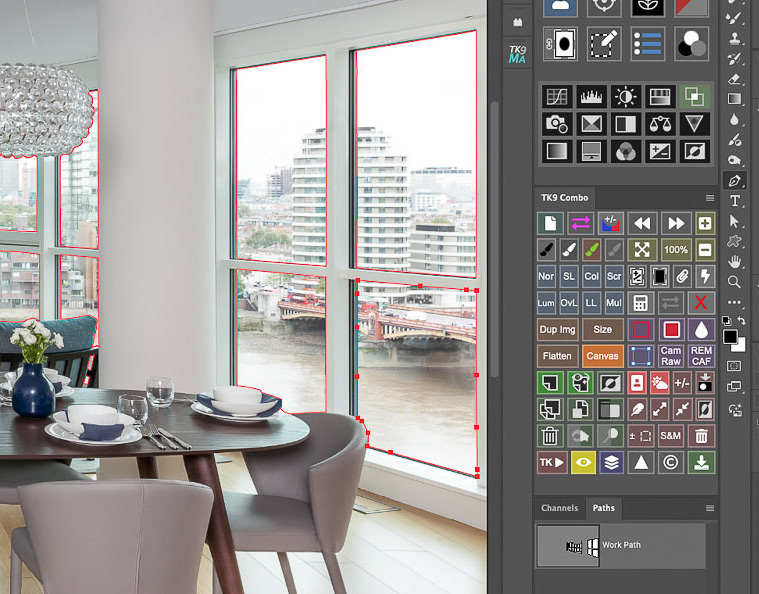
Selecting the window panes with the Pen Tool in Photoshop and creating a layer mask enables the two exposures to be combined. BUT ... there are some bright highlights on the furniture and flooring which could do with toning down... but these are hard to select...

By combining the hard edged window panes selection mask with a luminosity mask of the very brightest areas in the room, a more convincing blend can be achieved.
Here's a break down of how I go about it: please click on the first image to get a larger view with captions.

Starting out with one image to suit the exterior view and a second, optimised for the interior...

... they are opened as layers (or smart object layers for greater control) in Photoshop.

Using a combination of the Pen Tool plus Photoshop's other selection tools, I select the window panes....
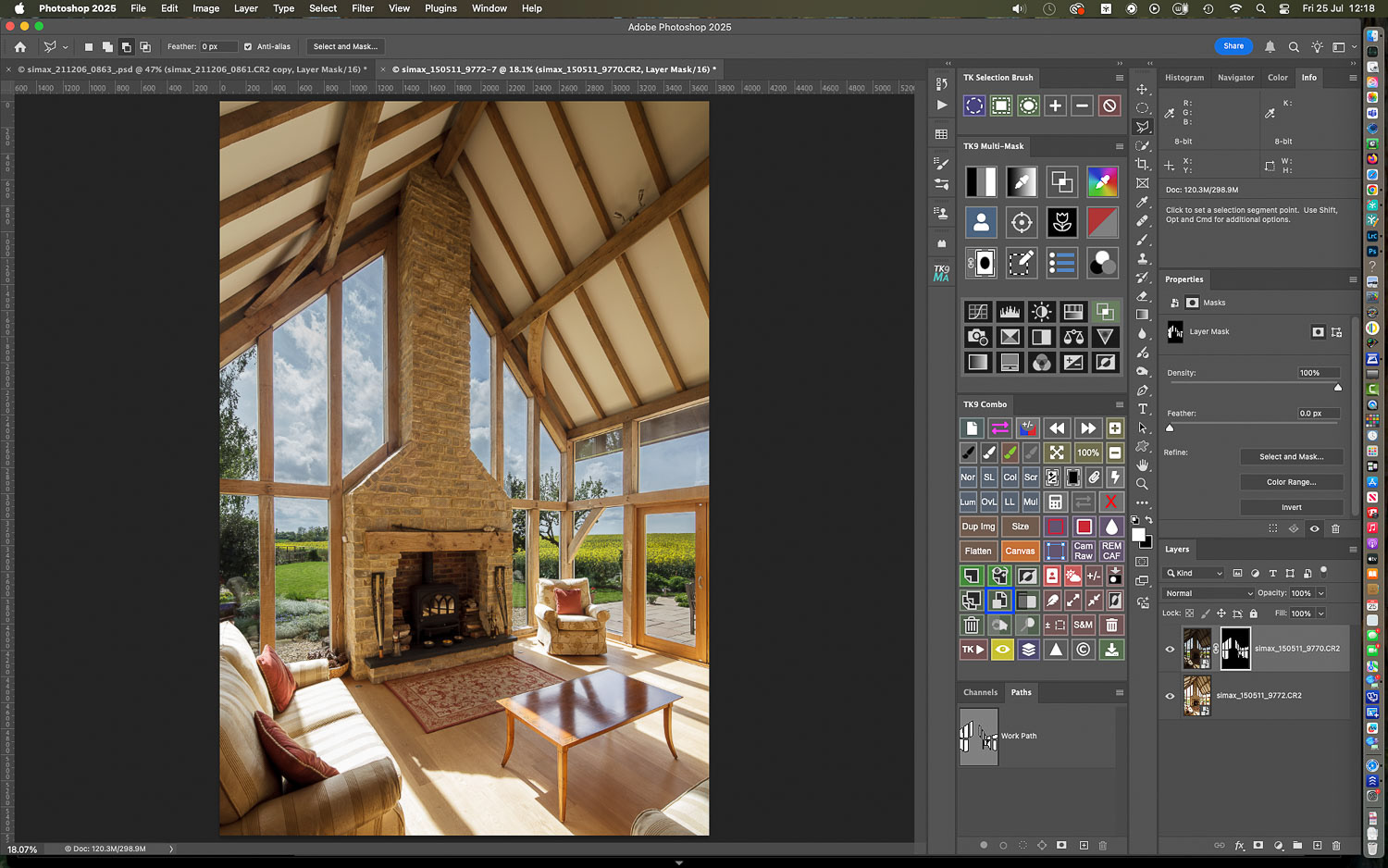
with the darker layer on top of the stack, a layer mask is created to show the view only...
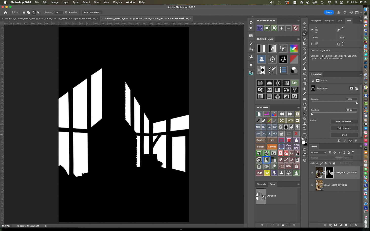
Here's the mask created from the selection: but you'll notice it is either fully white (all content revealed) or fully black (all content concealed)...

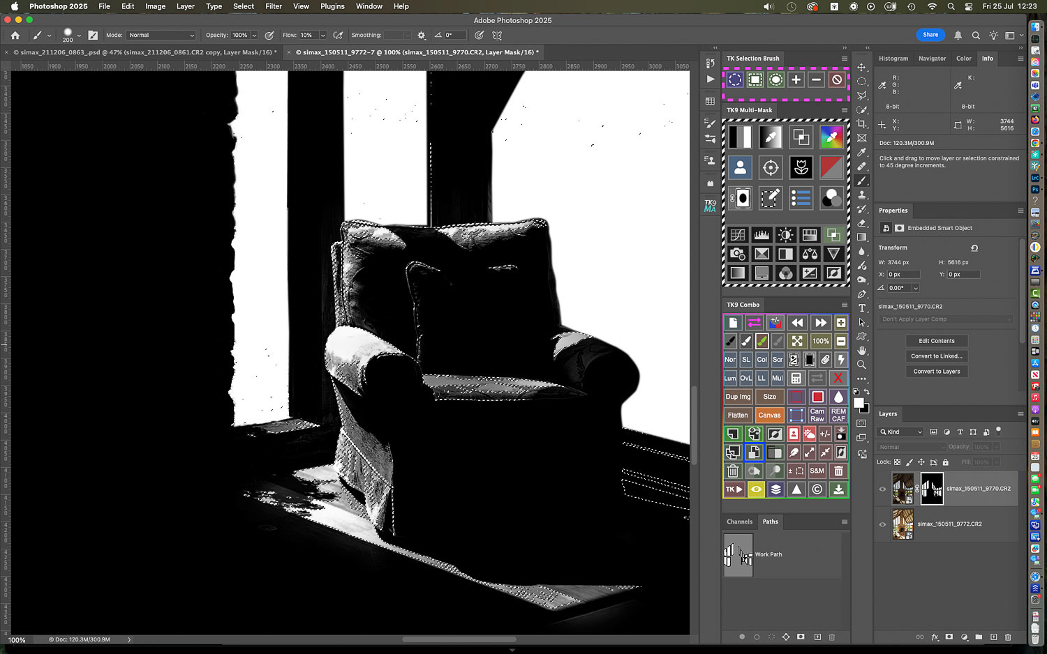
While the exterior is looking more readable, there are still some very bright burned out areas in the room; the light falling on the chair, for example, is of similar luminance to that illuminating the exterior...

But selecting those areas with the usual selection tools is very hard: using the TK9 luminosity mask panel I can make a selection of a very light value from the chair...

and create a mask based on similar luminance values: here's the mask and this time you'll see that it contains grey areas: it can feather the bright selected areas very nicely by partially selecting pixels based on their luminosity...

I'll now load the luminosity mask as a selection ONLY, over the window pane layer mask created earlier...

Using a low opacity white paintbrush I can paint selectively through the selection guidelines to just brush back detail in the most burned out areas.
I can check the mask from time to time: you'll see the grey tones on the furniture and flooring versus the pure white blocks over the windows created by the first mask...

Areas can be brushed back incrementally...

The luminosity mask selection protects the lower values which remain black: brushing in the selected areas therefore does not have to be overly precise.

That highlight on the stonework is a bit arresting...

more of the top (darker) layer can be brushed through for best effect...

but the area is not simply filled with white: the grey tones enabled by the luminosity mask enable very subtle variations.

The blended image with more of the room hot spots taken down...
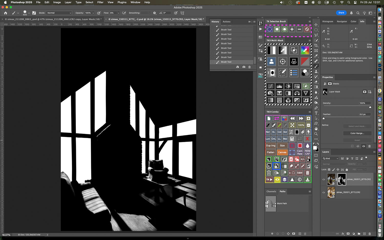
And the complete layer mask: note how the windows are fully white and "cut out", while the room contains varying tones of grey...

The window selections are relatively hard edged but the selections in the room are graduated and impossible to achieve with standard masked selections...
To prove the point: I'll select the combined mask for the upper layer...

And create a color fill layer....
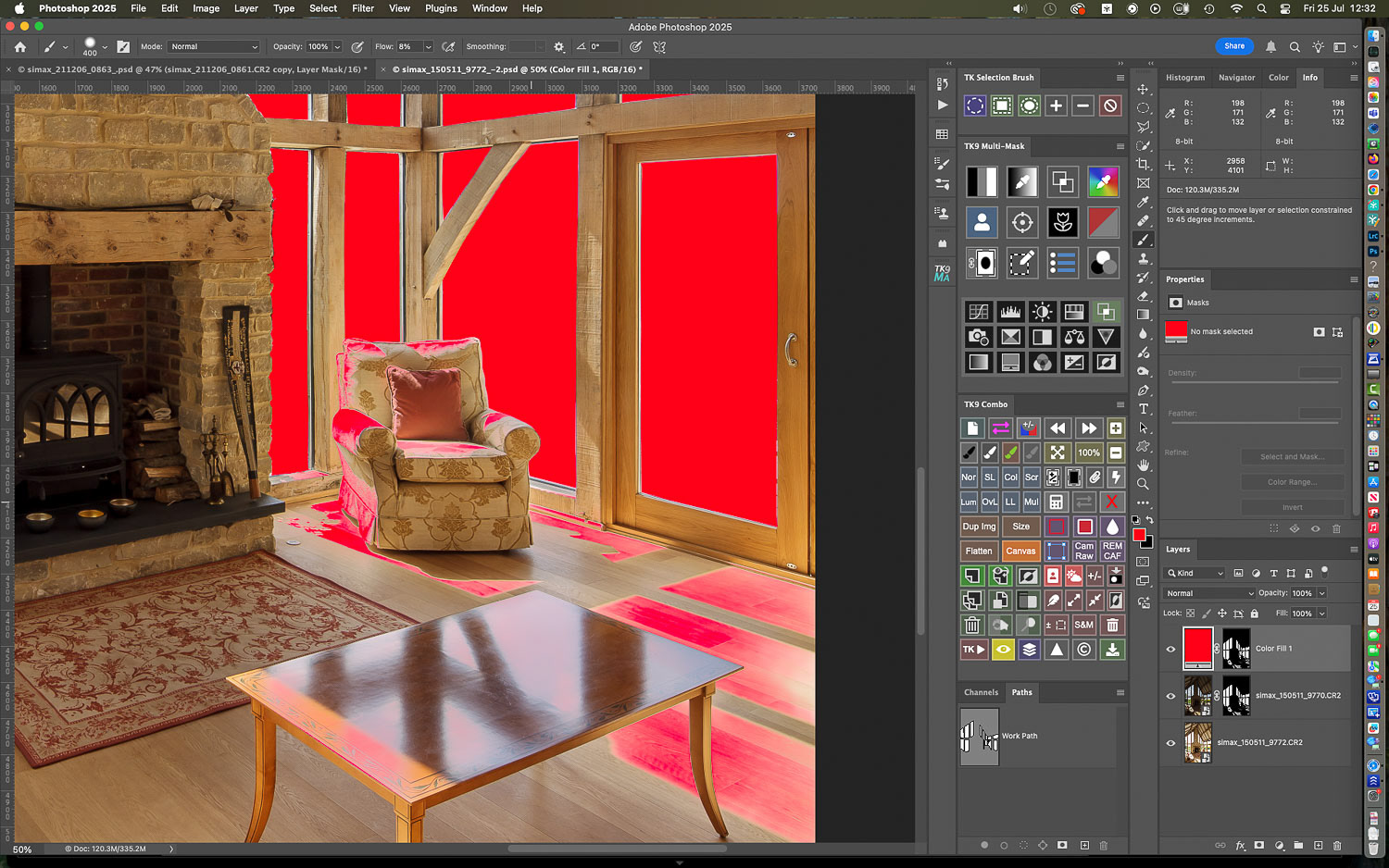
You can see the big blocks of fully applied color over the windows as opposed to the graduated colors in the luminosity masked areas...

It's two very different methods combined...
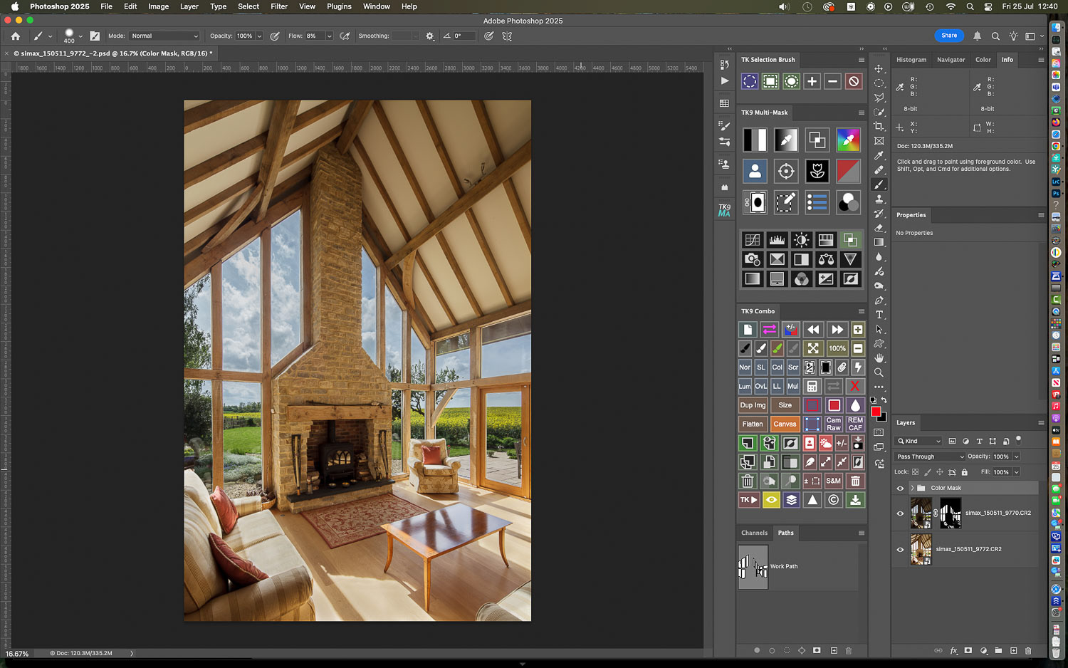
The finished result.

To compare: here's the room shot...

And the exterior view simply masked in but with burned out areas in the room...

The combined mask one more time: big thanks to luminosity masking!
While it's possible to apply luminosity masks in Photoshop with its own tools, far greater control (and efficiency) are possible via one of the third party Luminosity Masking plugins which are available. Two such are Lumenzia by Greg Benz and TK9 by Tony Kuyper. Both have their merits and offer a free to use basic version.
I personally favour TK9 for its extended features but I recommend trying them both to see what works for you.
Got a problem image?
Or do you just prefer being behind the camera rather than chained to the computer?
If so, why not look into outsourcing your image editing and retouching?
If so, why not look into outsourcing your image editing and retouching?
Feel free to contact me at any time: I can lighten your processing load at very reasonable per image rates!