
What is a colour managed workflow? And does it matter?
The short answers are :
A system to ensure consistent colour representation and reproduction for all digital imaging devices,
from capture to display to output,
And : yes it does!
A system to ensure consistent colour representation and reproduction for all digital imaging devices,
from capture to display to output,
And : yes it does!
The brief version:
A colour managed workflow will give you the confidence to capture, display and output consistent colour (within the limits of the printing media). It requires that three key areas of the digital imaging process are carefully monitored and controlled, or "calibrated". We need to:
Calibrate the monitor to display correct colour and brightness
Calibrate the camera to record colour and contrast correctly
Calibrate the printer so that output color will match the monitor
Sounds straightforward? Well it is, but it does require a methodical approach and some investment of time and equipment.
Calibrate the camera to record colour and contrast correctly
Calibrate the printer so that output color will match the monitor
Sounds straightforward? Well it is, but it does require a methodical approach and some investment of time and equipment.
There follows the long version which I hope will be a useful reference for those looking to achieve similar! If you are a gallery owner/ artist or a business working with colour-critical materials or products, please don't hesitate to reach out to me if you need assistance with implementing your own colour managed system. I feel confident I will be able to save you a lot of headaches!
Calibrating your monitor with on-screen profiling: is your red really red?
For any colour managed workflow you need to be able to confidently assess colour as it is displayed: very often consumer monitors, straight out of the box, can be set overly bright . Have a look at the scale of grey tones below: not only should the grey values in the middle of the scale appear neutral (that is, without any hint of colour cast, such as cool blue, warm yellow or even green/ magenta) but you should also be able to distinguish clear steps between the very dark tones at the right of the scale and the lighter tones on the left. If either end of the scale appears blocked up, i.e. one long band of the same tone, that is a clear indication that your monitor's brightness, or luminance, is set to too bright or dark a setting:

Both colour fidelity and a balanced luminance level are essential for correct representation of digital images on screen. While monitors come with manual controls for adjusting brightness and contrast, and in some cases their white point (i.e. the warmth or coolness of neutral tones), these are generally very basic and can be time consuming to adjust. They are no substitute for a proper monitor calibration.
So first off, you need to ensure that your monitor is calibrated to an industry standard, both in terms of its brightness or “luminance” and its representation of colours. To put it simply, monitors need to be “tied” or calibrated to an agreed standard so that a particular hue (let’s say Post Office red) is actually represented on your monitor or screen as that exact red, with the correct mix of red green and blue elements (or RGB values) .
For any kind of professional calibration of a monitor, it is essential to invest in an external calibration tool. This comes in the form of a sensor or probe which is hung over the tilted monitor. A monitor calibration tool like the Calibrite 1 One Pro Display is draped over your monitor (see below) while its software projects a series of coloured and neutral grey patches at it: by reading each patch, it can establish to what extent your monitor is deviating from an agreed norm in terms of colour representation, screen brightness and contrast. It can then correct for any discrepancies by creating a set of colour and brightness/ contrast adjustments, know as a “profile”, for that monitor. In this way, when you view an image on your calibrated monitor and you send it to a printing lab with their own properly calibrated monitor, you can be sure that each monitor will display your image in the same way, essential for carrying out any kind of remote adjustments or revisions.
For any kind of professional calibration of a monitor, it is essential to invest in an external calibration tool. This comes in the form of a sensor or probe which is hung over the tilted monitor. A monitor calibration tool like the Calibrite 1 One Pro Display is draped over your monitor (see below) while its software projects a series of coloured and neutral grey patches at it: by reading each patch, it can establish to what extent your monitor is deviating from an agreed norm in terms of colour representation, screen brightness and contrast. It can then correct for any discrepancies by creating a set of colour and brightness/ contrast adjustments, know as a “profile”, for that monitor. In this way, when you view an image on your calibrated monitor and you send it to a printing lab with their own properly calibrated monitor, you can be sure that each monitor will display your image in the same way, essential for carrying out any kind of remote adjustments or revisions.
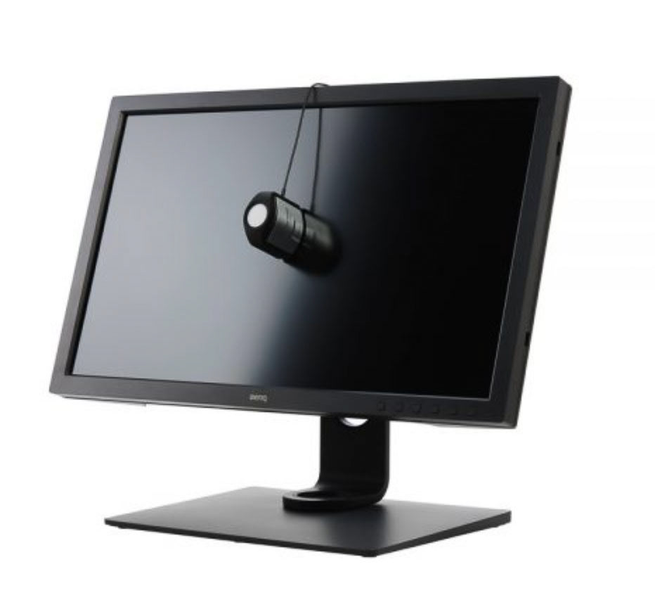
Above: a calibration device is draped over the centre of the monitor (tilting the monitor upwards helps to ensure that the calibrator's probe rests evenly on the screen), ready to read a series of projected coloured and grey squares of light, which will be compared against an industry standard.
Next : calibrate your camera...
With your monitor calibrated you can look to now ensure that what is shown on your calibrated display is also calibrated! If you are a business or gallery who is simply viewing images supplied by a professional photographer, you can skip this step and move on to output...
With your monitor calibrated you can look to now ensure that what is shown on your calibrated display is also calibrated! If you are a business or gallery who is simply viewing images supplied by a professional photographer, you can skip this step and move on to output...
When it comes to capturing colour via the camera, a similar issue as that applicable to monitors exists, namely that different camera sensors (even those of the same make and model) will record colour very slightly differently to one another. And in the same way that monitors can be “reined in” in terms of their display of colour, cameras can likewise be calibrated, or “profiled”, in order to see where they are effectively making minor errors when recording colour. While the monitor calibration process requires that red, green and blue light is projected towards a calibration device, i.e by transmission, for the creation of a camera profile we need to actually photograph a real coloured physical print or “target”. This takes the form of a collection of hand painted colour patches, i.e. opaque media, which are recorded via the the light transmitted from them. For the most accurate profile this target needs to be very carefully illuminated and photographed in RAW format under ideally controlled conditions so as to record all the patches (usually 24 in total) as evenly and as clearly as possible. But for less manageable situations it is still helpful to include the calibration target in a test image.
One such target is the Color Checker Classic 24 patch from Calibrite (see right)
One such target is the Color Checker Classic 24 patch from Calibrite (see right)
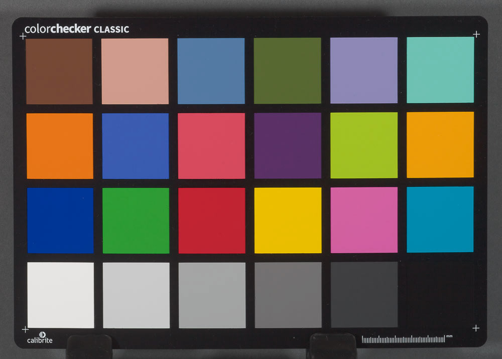
A color calibration target : the Color Checker Classic from Calibrite.
Profiling the image of the target
The resulting image of the target is then run through a software system which in turn assesses to what extent the recorded colour values (in red, green and blue) deviate from the internationally agreed standards for the particular hues of the colour patches. So, for example, the digital recording of the red patch in our industry standard target should, in a perfect world, be pegged at the following values: R(ed): 230 G(reen): 49 B(lue): 18 : the software may detect that your camera’s actually recording of that patch results in a reading which is low in Red, or high in Blue, leading to a slightly weaker or more purple-tinged red than the accepted value.
With this understanding of the tested camera sensor’s particular colour recording characteristics, or “bias”, a profile can be created for that camera which will adjust those deviations from the norm. Effectively the profile acts like an instruction to alter the mix of the recorded colours in a remedial way to ensure consistent and industry-agreed colour (for the photographed colour patches at least!) When the image is opened up into an image editing software platform like Adobe Lightroom, the appropriate profile can then be applied to the image.
Generally, a profiled digital image will display improved colour rendition for a given lighting situation, versus one which is simply profiled with a generic profile supplied by the camera manufacturer or software. However, for critical colour reproduction (when photographing products or artworks for example) we need to fine-tune the camera profile creation process.
Profiles aren’t the end of the story : the contrast curve
Camera manufacturers enable different camera profile settings to be applied to digital images: these have tags such as Camera Standard, Camera Faithful and Camera Neutral etc. RAW processing software like Adobe Lightroom offer their own approximations of such profiles and also their own offerings such as Adobe Portrait or Adobe Landscape profiles. Many of these general or "canned" profiles attempt to create striking results for frequently photographed subjects: so a landscape profile might actually boost the green hues in an image, while other profiles might look to enhance skin tones for better impact. While theoretically a Camera Neutral or Camera Faithful profile should not apply too much adjustment to recorded colour, a bespoke (i.e. separately created) profile is still preferable for truly objectively recorded colour. But even then, an image with a bespoke profile applied via third party software will still have some adjustment applied to it on import into a raw image editing software: this is a contrast adjustment applied to basically bring the image to life.
Why is this contrast adjustment required?
We need to take a step back and define two separate elements of the profiling process: firstly, the profile aims to establish a faithful recording of the target image according to industry standards, in other words to ensure the actual colour hues are represented accurately. But if we were to simply present the image with the colour profile corrections in place, we would have what they call a linear profile. A linear profile results in a very flat, or low contrast, look to the image. Due to the way that digital capture devices record light, i.e. in a linear manner, a certain amount of contrast adjustment needs to be applied to the recored image so that it matches our perception of the real world scene. So the second element of any profile creation involves the application of some contrast adjustment (that's where the sequence of grey patches on the calibration target is referenced).
Most digitally captured subjects and scenes can benefit from some increase in contrast. But flat copying of paintings for example often features a subject with a much reduced image contrast which is well within the capture-able range of the camera. When a standard or canned profile is applied to such images, the result can look overly contrasty and even too saturated when compared to the original when viewing under similar lighting conditions as those employed at the shooting stage.
Linear profiles ensure that the true, untouched but properly calibrated colour data is preserved in the digital file. They are essential for any colour-critical reproduction work, and represent the perfect departure point for further contrast adjustments, aimed to suit the particular subject, which might actually be more subjective. See below:
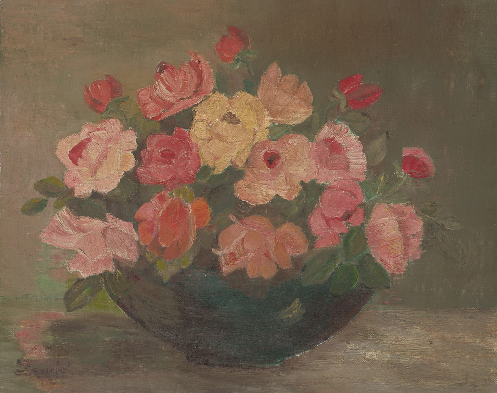
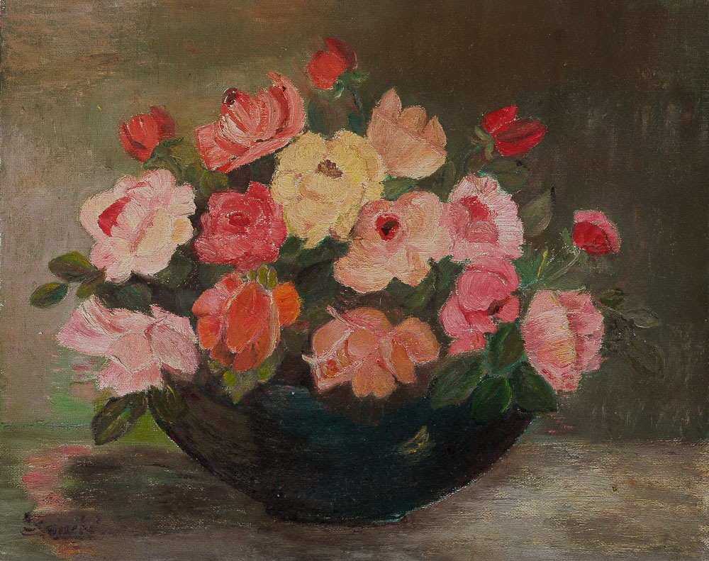
Above; a copy of an oil painting with a linear profile applied.

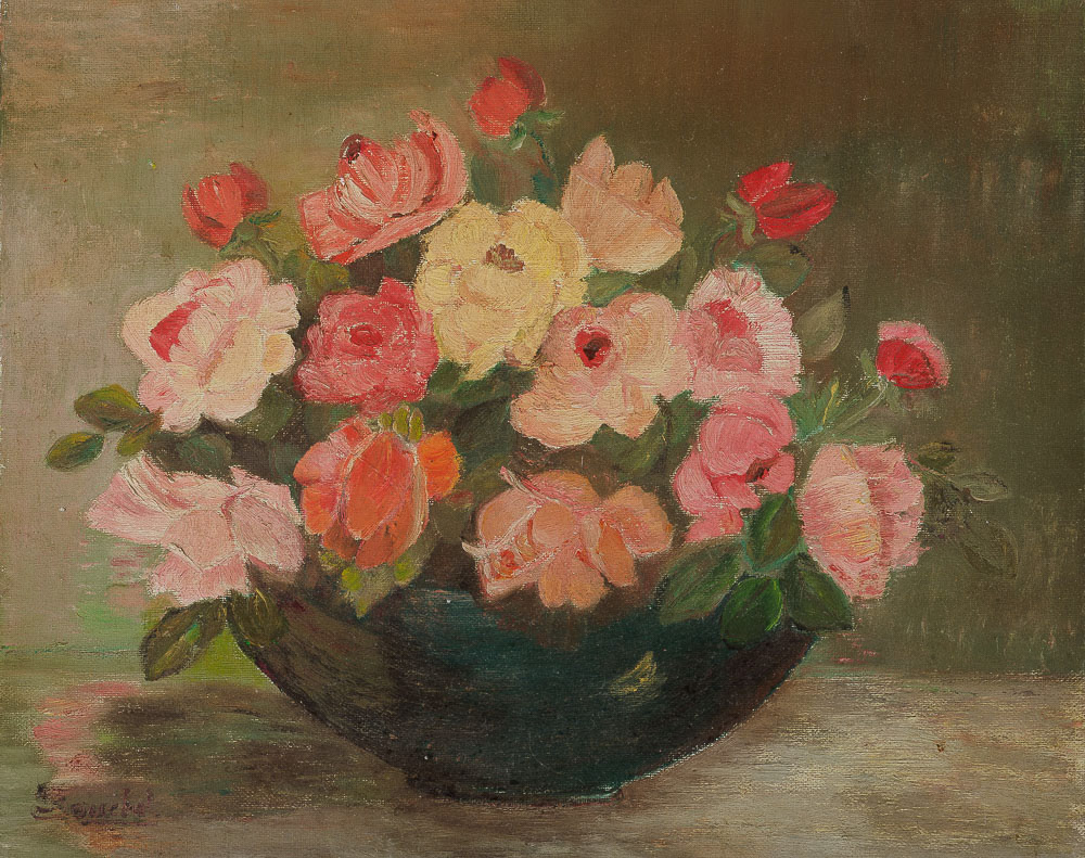
Above: the same profiled image with careful contrast adjustments applied to match the contrast levels of the original painting.
The reproduction mode in Lumariver and other systems
So thankfully there are some software systems which will enable the creation of a custom camera profile specifically geared towards reproduction: and this is known as a linear profile, since it has absolutely no curve adjustment applied to it.
Linear profiles can be created via Adobe’s free DNG Profile Editor Software. However, I prefer to use the extremely advanced Lumariver Profile Creator software which has a dedicated reproduction mode.
A curve adjustment usually follows the shape of an S and applies some darkening of the lower values in an image and at the same time brightening of the lighter tones. This restores some crispness to the image due to the increased contrast. But it is of course based on an algorithm which might not entirely suit the subject matter, especially if that is 2D flat copy artwork which does not contain the sort of dynamic tonal range (or the spread between the very lightest and darkest luminance values, or tones) which one might normally encounter in a real world scene.
For the creation of the most precise profile it is necessary to split the setting of the hues in the image and the following application of a contrast curve befitting the subject. The first is achieved automatically via software “reading” an existing image of a profile target: the second involves carefully creating a contrast curve based on measurement of an image of a linear grey scale chart to which the linear profile has been applied. The latter is of course more open to user intervention and to some extent a subjective approach based on the subject matter, but starting with a linear profile also enables very precise mapping of the file to match the contrast of say a grayscale chart which might be photographed alongside the original. See below:
Above: the image seen earlier with a straight linear or repro profile applied, plus additional adjustments to the contrast curve...
The same image but with a Camera Neutral profile applied: while colour fidelity is quite good, the contrast adjustments applied by the canned profile are far too strong when compared with the original resulting in the loss of subtle shadow and highlight detail.
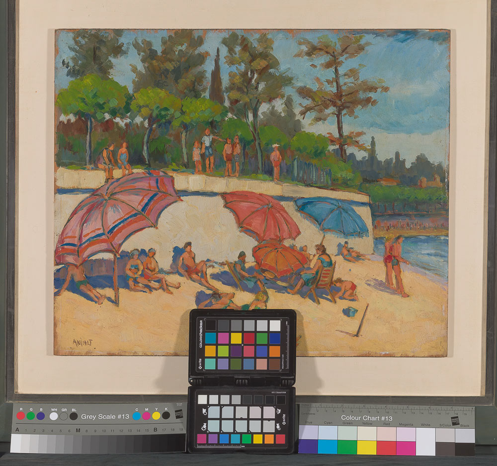
Above: the test image, with only the linear profile applied, includes both a Colorchecker Passport for profiling but also grey scale chart at left (at right is a colour chart to assist with colour assessment).
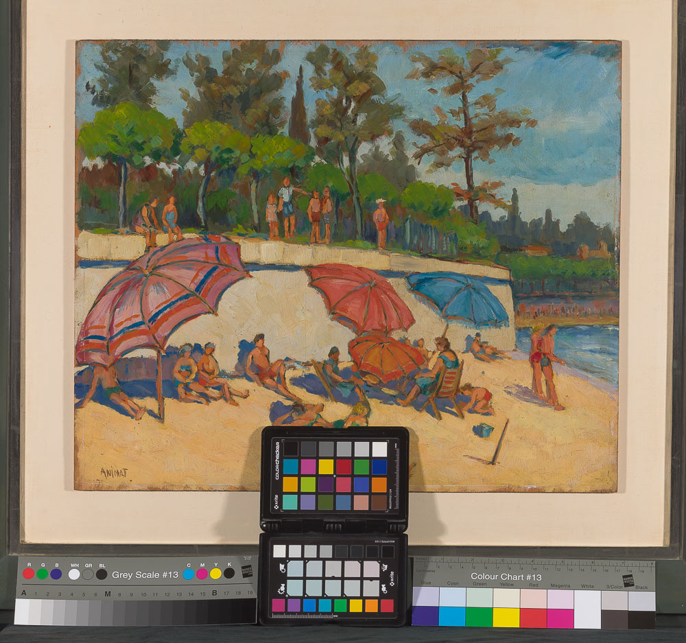
Above: with the digital image opened in a RAW editing software, measurements can be taken from the grayscale followed by appropriate contrast (and possibly brightness) adjustments. Notice the slight increase in contrast applied to the linear profiled image for better effect: white tones are more "crisp-looking" and the very darkest blacks are taken down slightly in value.
I actually use Lumariver's repro mode to create linear profiles when creating camera profiles designed for photographing three dimensional objects, although in many cases Lumariver's extremely good general purpose profiles (which include a generic contrast curve adjustment) are very adequate. I have found that for products with strong, glossy colours, such as metal product containers, I have actually matched product colours more accurately by using a repro profile and carefully applying an independent contrast curve to the image.
Checking the quality of the camera profile
There is a final step to be carried out for really critical camera profiling. This involves uploading a version of the target image used to create the profile to a third party site which will scan the image and assess its tone and colour accuracy i.e. the extent to which the output RGB values of the recorded colour patches in the profiled file deviate from industry-agreed standards.
Two bodies which have set such standards are METAMORFOZE – a venture between the National Library and National Archive of the Netherlands, and the Federal Agency Digitization Guidelines Initiative (FADGI) – a US based interagency government collective. They both set standards for what is known as Delta E.
Delta E is measured on a scale from 0 to 100, where 0 is less colour difference, and 100 indicates complete distortion, so any value for Delta E refers to a colour error in recording. FADGI guidelines, for example, state that all measured colour error values must fall below a certain maximum value (value=6), and they also set an average figure for colour errors which cannot be exceeded (value=3) .
The very useful Delta E initiative enables you to upload an image file for free to their dedicated website
FADGI offers a tiered system of star ratings to gauge the quality of profiled image files, with one star representing very low quality and four stars demonstrating what they call "preservation grade quality". More information can be found here>>>
It is a simple process to upload your processed file to the Delta E website : you will need to create a user account and ensure your file is in TIFF format. The result can be assessed according to FADGI or METAMORFOZE measuring standards, and, in the case of FADGI, their star rating plus figures for maximum and average Delta values will be listed. See below:
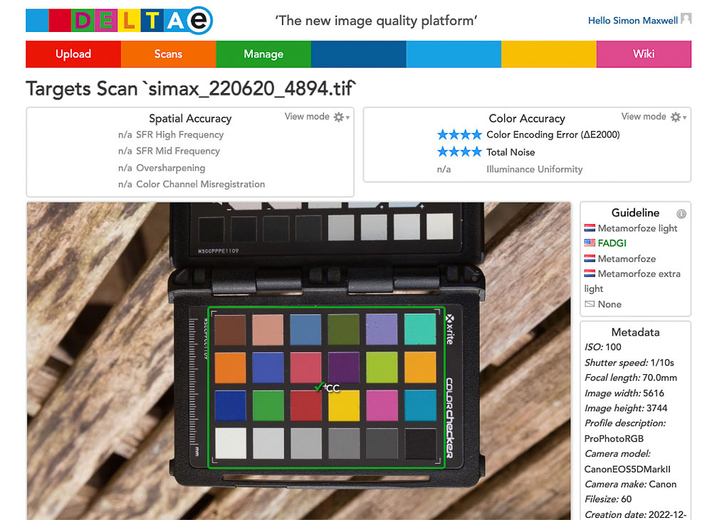
Uploading an image to Delta E's website will provide a star rating according to its departure from theoretically perfect colour rendition, known as its Delta E value. My profiles are always tested against this benchmark.
Printing : can you ever match the output print to your on-screen image?
So: you have an accurately calibrated monitor and a precisely calibrated profile to apply to your digital files to ensure that you are images and colour accurate with tonal levels set appropriate to the subject. What about taking that captured image and outputting it to a hard copy print? This, for most of us, remains the "Holy Grail" of digital imaging and probably represents one of the most complex aspects of a colour managed workflow, as it can introduce a number of variables.
If you want to ensure that your hard copy output is a decent match for the original, it is essential to ensure that your printer is correctly profiled. In just the same way that it is necessary to calibrate your monitor and the camera, printers too are colour output devices with their own characteristics, and which require profiling to bring them in line with a commonly agreed standard. And, again, their output will vary even between identical makes and models using the same branded inksets. To further complicate matters, different brands and types of paper you use will yield different results. All possible combinations need to be individually profiled.
If you want to ensure that your hard copy output is a decent match for the original, it is essential to ensure that your printer is correctly profiled. In just the same way that it is necessary to calibrate your monitor and the camera, printers too are colour output devices with their own characteristics, and which require profiling to bring them in line with a commonly agreed standard. And, again, their output will vary even between identical makes and models using the same branded inksets. To further complicate matters, different brands and types of paper you use will yield different results. All possible combinations need to be individually profiled.
The key to achieving "accurate" printed colour output lies again in calibration of our equipment: in the case of most photographers and small businesses this will be an inkjet printer. The task is to find out what your printer's colour bias is for a given set of inks and a given paper type: with that information, a profile for the printer can be created, to correct for any deviation from industry-agreed values for output colour. In the same way that we assessed how our camera captures colour, with our printer we are examining how successfully it can render those captured colours on different hard copy media.
To profile your printer, you will need to print out a special image, supplied by the company creating the profile (see illustration below). It is essential to print this image out at the size stipulated (generally A4) and with no colour management applied. But rather than printing this image out through your usual image editing program (e.g. Photoshop) you will need to download Adobe's Adobe Color Printer Utility software (ACPU) from this page>>> The reason for this is that it has become very difficult to ensure that no colour management of any kind is applied when running a print in the usual way. The ACPU software specifically addresses this issue and your print will be a true reflection of what your printer is outputting without any adjustments being made, which would produce a skewed result: your profile generator would effectively be having to create a profile for an already semi-profiled print.
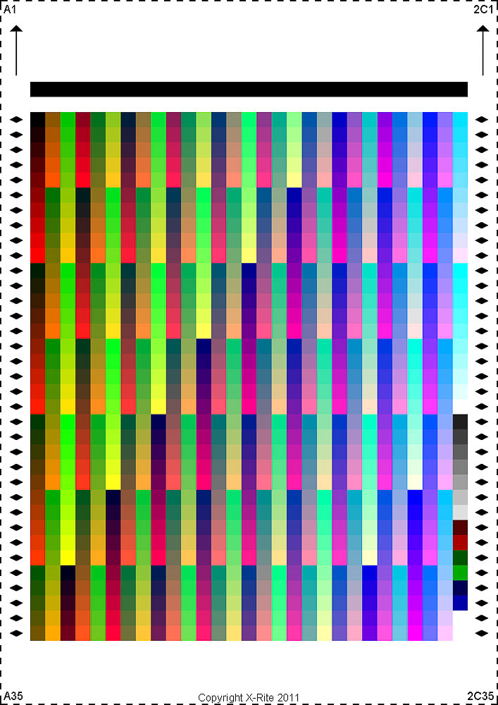
Above: the test print you will need to print out and have read by a company with a spectrometer: your printer and ink set, plus your chosen paper type, will all have a bearing on how well the patterns of colour hues are reproduced, leading to the creation of a profile specific to your printer, ink and paper combination. This will "re-mix" the colours in order to eradicate any colour distortions pinpointed by the calibration process. Ensuing prints made on the same paper and ink and printer system should render colour very well.
The printer calibration print (above) consists of a series of colour patches. You can see that this is actually a much more complex “target” image than that used for calibrating camera sensors.
A UK company who can assist with creating bespoke profiles are Permajet; they have a very good online resource here>>> They offer free profiles for their own paper types but can create profiles for other brands for a reasonable fee.
Please note that if you are an Apple user whose machine is running Catalina or a more recent Operating System, unfortunately there seems to be an issue or bug experienced when running ACPU. First of all, the OS can refuse to install ACPU, throwing up a security message warning that the identity of the developer cannot be guaranteed. This can actually be fixed by enabling the developer of the app (i.e. Adobe) in the Security tab of the Apple OS preferences. However, some users still seem to receive disappointing results when running the print through the software. If in any doubt contact the company who are creating the profile first for their advice. Hopefully Apple and Adobe will get together at some point to rectify this issue. Meanwhile, I strongly recommend visiting this helpful page about creating printer profiles if you are an Apple user: the Digital Dog which includes a pdf file which explores a workaround to this issue.
The printed result is then sent back to the company creating the profile and read with a spectrophotometer and, rather like the monitor calibration device reading transmitted RGB wavelengths, this hardware reads the light reflected from the printed patches with their CMYK inks. From this, the software is able to gauge where the printing inks are failing to be deposited correctly for proper rendering of the colour patches. It creates a bespoke profile for that printer/ink/ paper combo, which is emailed back to you and needs to be installed on your computer in the appropriate Profiles folder. When printing with that printer, and that set of inks and that paper, provided the appropriate created profile is selected in the printer dialogue options, you should be able to match the colours on your screen…. But with one major proviso… read on!
Soft profiling:
- Using your created printer/paper profile to get an idea of what your final print will look like.
So you print out your image with your newly created bespoke profile and rush to see how it compares to the on-screen version.... but, to your dismay, it doesn't seem to match it exactly. What's gone wrong? Well, provided you have taken steps to print out your printer profile target print as advised, nothing! Your on-screen image needs to be adjusted very slightly, and a couple of things borne in mind, before your make that side by side comparison.
So you print out your image with your newly created bespoke profile and rush to see how it compares to the on-screen version.... but, to your dismay, it doesn't seem to match it exactly. What's gone wrong? Well, provided you have taken steps to print out your printer profile target print as advised, nothing! Your on-screen image needs to be adjusted very slightly, and a couple of things borne in mind, before your make that side by side comparison.
By far the most frequent observation when comparing prints to a monitor, is that the printed version looks darker. While this can certainly be the case when a monitor has not been properly calibrated and its brightness has been set too high (generally the case with all monitors out of the box), it is more a function of comparing an image viewed by reflected light, i.e. the print, with the same image presented via transmitted light, i.e. a backlit display. The former is always going to seem to have greater richness and luminosity than its hard copy equivalent. It’s rather like looking at a painting simply hung on a wall, as opposed to viewing a stained glass window; the latter’s colours appear more saturated and the luminance range from light to dark is greater. With the hard copy print, there is a compression of the tonal range, with a potential loss of subtle shadow detail. Neither is inherently better than the other but the viewing experiences of each are definitely different. We are talking about transmitted luminance levels of red, green and blue light (additive) displayed on a back-lit screen being compared to the reflected light from the physical pigments of Cyan, Magenta, Yellow and Black inks (CMYK) deposited on a paper surface (subtractive colour). So try to accommodate that difference in your mind when drawing comparisons.
Next, we need to consider gamut: that is, the range of colours which can be produced via your printers’ inkset on your chosen paper. Some papers (notably matt ones) will have a more restricted gamut than glossier surfaced versions. However, just about all papers will lack the full colour gamut on display when viewing an RGB image on a professional grade monitor. This can be especially apparent when the image file contains very intense, saturated hues.
Thankfully there is a way to at least incorporate the restricted gamut of the output print by constraining the on-screen image to the reduced saturation of the print; this is called soft proofing and is simply achieved by selecting the same bespoke printer profile used to print the image and viewing the file in Proof or Soft Proof mode or its equivalent, depending on your image editing software.
You are effectively setting your monitor to “mimic” the way that your paper and ink combination is likely to represent monitor colour: not only can the colour gamut of the media be approximated but so too can the actual paper surface and any inherent warmer or cooler tint it possesses. When soft proofing is enabled, the colour profile which you will use to print with will be referenced so as to produce an accurate on-screen match.
Rendering intents...dealing with out of gamut colours
You can choose to deal in two ways with those colours of the file which fall out of gamut by employing different rendering intents when soft proofing (and subsequent printing) ; rendering intents simply refer to how the out of gamut colour issue is addressed:
Firstly, the Relative Colorimetric rendering intent will simply ignore out of gamut colours. By contrast, the Perceptual rendering intent will look at the out of gamut colours and transpose them to the next in-gamut hue in the spectrum: so a very intense out of gamut blue might be represented by a slightly weaker version. In this way, the Perceptual approach can create smoother transitions and gradations but of course via a process of invention which might not appeal to the creators of copied work, while the Relative Colorimetric solution does not invent any "new" colour, but for that reason can lead to slightly less smooth or "blockier" colour transitions. The answer is to soft proof with both options and print on a case by case basis, using the rendering intent which best suits the image.
Please note that if your monitor itself is not properly calibrated you will never be able to properly compare your print with the on-screen version.
Please note that if your monitor itself is not properly calibrated you will never be able to properly compare your print with the on-screen version.
Creating a corrected print
So, before you actually print, you may want to make some adjustments to the file, or create a proof copy to address some of the issues thrown up in the soft proofing process. In the case of very intense or vivid originals, please note that you can’t put colour where none exists! At best you can bring a bit more saturation (within limits) to the existing in-gamut colours.
The apparent “dullness” of some papers, matt versions especially, can be compensated for by increasing the brightness and/ or contrast of the image: if you create a version of the file with such adjustments in Lightroom for example, the option to create a proof copy is enabled, so that this can be quickly accessed if you want to make additional prints at a later date with the same adjustments in place.
The value of a proof print...
Unfortunately, you cannot second guess what viewing device a potential customer is using to view your images if you are a gallery or an artist or a company which relies on on-screen samples of materials or paint colours: the chances are it will not be properly calibrated and will be set to too high a brightness setting. Sending interested parties an accurate proof print is, in the scheme of things, a relatively inexpensive way to ensure that a client is able to make a decision to purchase based on the most accurate version of the original as possible.
Conclusion
So there you have it: the elements of a fully colour managed workflow.
Being able to create, view and print colour-accurate images is an essential requirement for many businesses involved in visual communication.
Being able to create, view and print colour-accurate images is an essential requirement for many businesses involved in visual communication.
Please contact Simon if you would like to find out more.