How to prepare single exposures of models so they can be dropped into interiors images efficiently.
An interiors image can often be the result of a number of exposures blended together for best effect, whether manually or via an HDR program. Generally, once the basic material for the interior itself has been shot, various frames are then taken with models in place, so that they can be dropped in later to the composite image in Photoshop via layer masks. This enables high ISO settings to be used for the model shots only, in order to enable faster shutter speeds to capture movement/ spontaneous expressions. Alternatively flash units can be placed in the scene to light models efficiently and these of course will be erased from the final composite.
But introducing a single shot, whether ambient or flash-lit, into a carefully processed composite can often result in slight mismatches in color and/or luminance; this makes selection of the model highly critical and may also require further adjustment layers clipped to the dropped in shot so that the subject appears properly integrated with the scene. When people are in motion, it makes the task even more difficult as blurred, semi-transparent areas are very difficult to mask off.
I believe one solution, rather than complex masking, is to ensure that the incoming model frames match the area of the composite in which they must appear as closely as possible in terms of hue and tone. And a little bit of time spent on the files in Lightroom prior to compositing can pay off big time when it comes to hand blending layers in Photoshop. Evening up images prior to blending can enable much easier selection and thereby softer masking of people frames.
The key to it is the Reference View mode in Lightroom's Develop module.
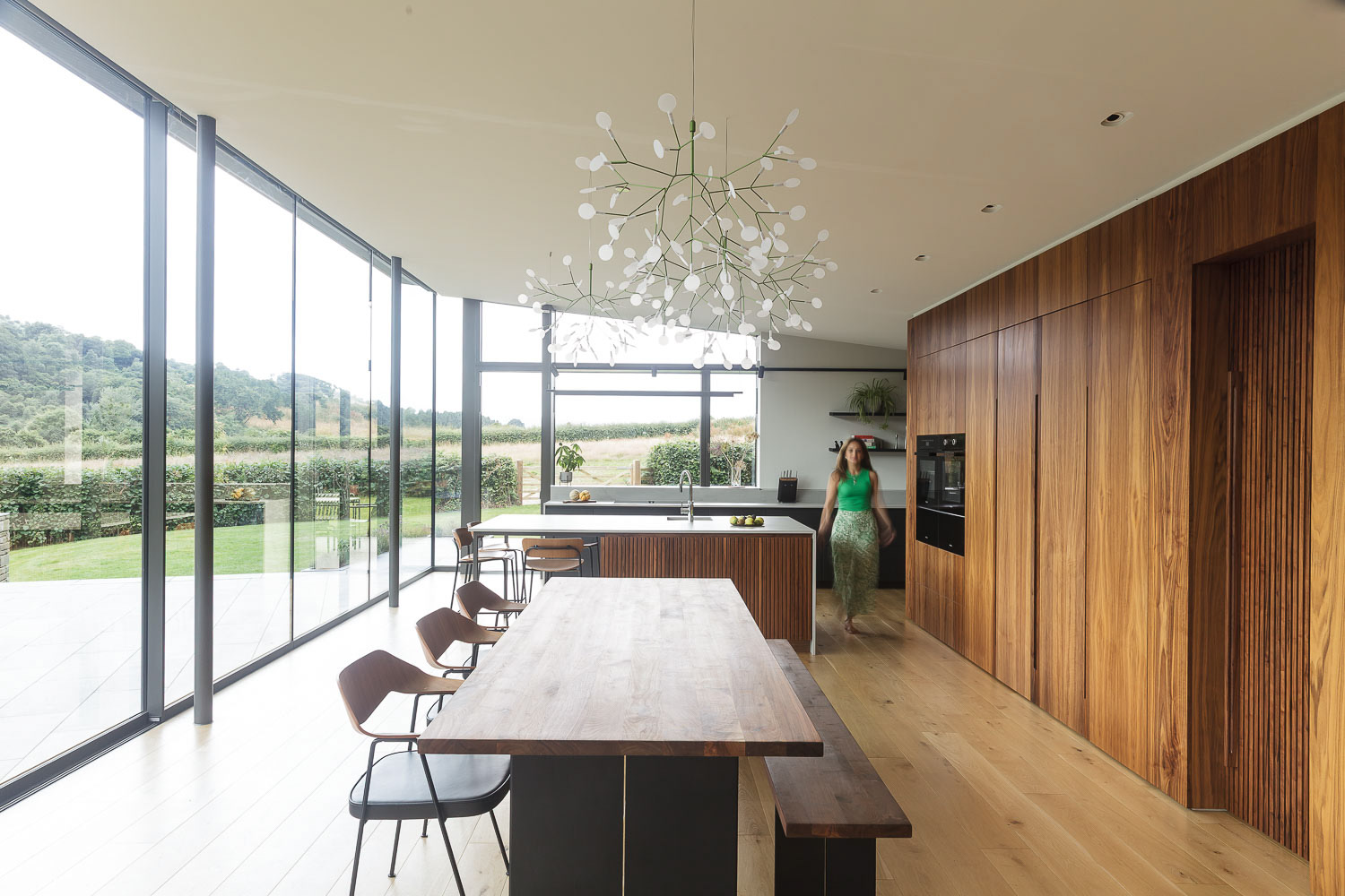
In the example below I have worked with a moving figure to be dropped in to an HDR blended scene.
I believe one solution, rather than complex masking, is to ensure that the incoming model frames match the area of the composite in which they must appear as closely as possible in terms of hue and tone. And a little bit of time spent on the files in Lightroom prior to compositing can pay off big time when it comes to hand blending layers in Photoshop. Evening up images prior to blending can enable much easier selection and thereby softer masking of people frames.
The key to it is the Reference View mode in Lightroom's Develop module.
In the example below I have worked with a moving figure to be dropped in to an HDR blended scene.
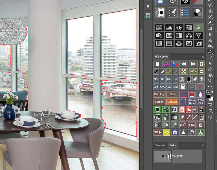
Please click on the first image in the sequence below for larger versions with captions>>>

My base image is an HDR merge of four bracketed shots....
and the single capture model shot: you can see how the single shot differs from the HDR blend: it is slightly bright, has much less dynamic range and there are also subtle variations in color which are going to make masking later in Photoshop more tricky....

Using the reference/ active facility in Lightroom, the main HDR image is dragged from the thumbnail strip to the left of the split view, while the thumbnail of the single RAW shot to be adjusted is simply clicked on to have it appear on the right:

adjustments can now be made to the model shot so that the immediate area around the person is better matched to the main shot. While this can be achieved via "eyeballing" and moving the basic sliders, I prefer a more precise approach...

When you mouse over any point in the active image, the readouts in the histogram will show the RGB levels of the Reference image on the left and those of the Active image on the right: you'll see above that the reference image figures for a chosen neutral area are very similar: those for the active image are not only higher but uneven in terms of RGB input...

Before any adjustments, you can see the mismatch between the main image and model shot (check out the RGB figures for the sampled area)...

After some careful adjustments using the tone curve the RGB readouts for the active image can be much more closely aligned with the reference image. (I've chosen a slightly lighter source point in the main image, with a value around 120, for this sample)...

using the curves point adjustment tool, and with the parametric curve icon selected above the curve, you can click on an area in the active image and drag your mouse up or down to adjust luminance: I am interested in the white area behind the model and the lights have been taken down there, to the point where the RGB readouts are better aligned...

I also needed to adjust the green channel in the curves dialog box slightly, applying some plus magenta to remove the green bias...

...the blue channel also needed some adjustment to add a bit of yellow: this brought the RGB figures for that neutral area in the active image to more similar values.

The area around the model is now a much better match for the main image: now to combine the images in Photoshop...

Opening the images as layers in Photoshop, I select both layers and auto align them. (My workspace layout includes the TK9 plugin control panels and menus).

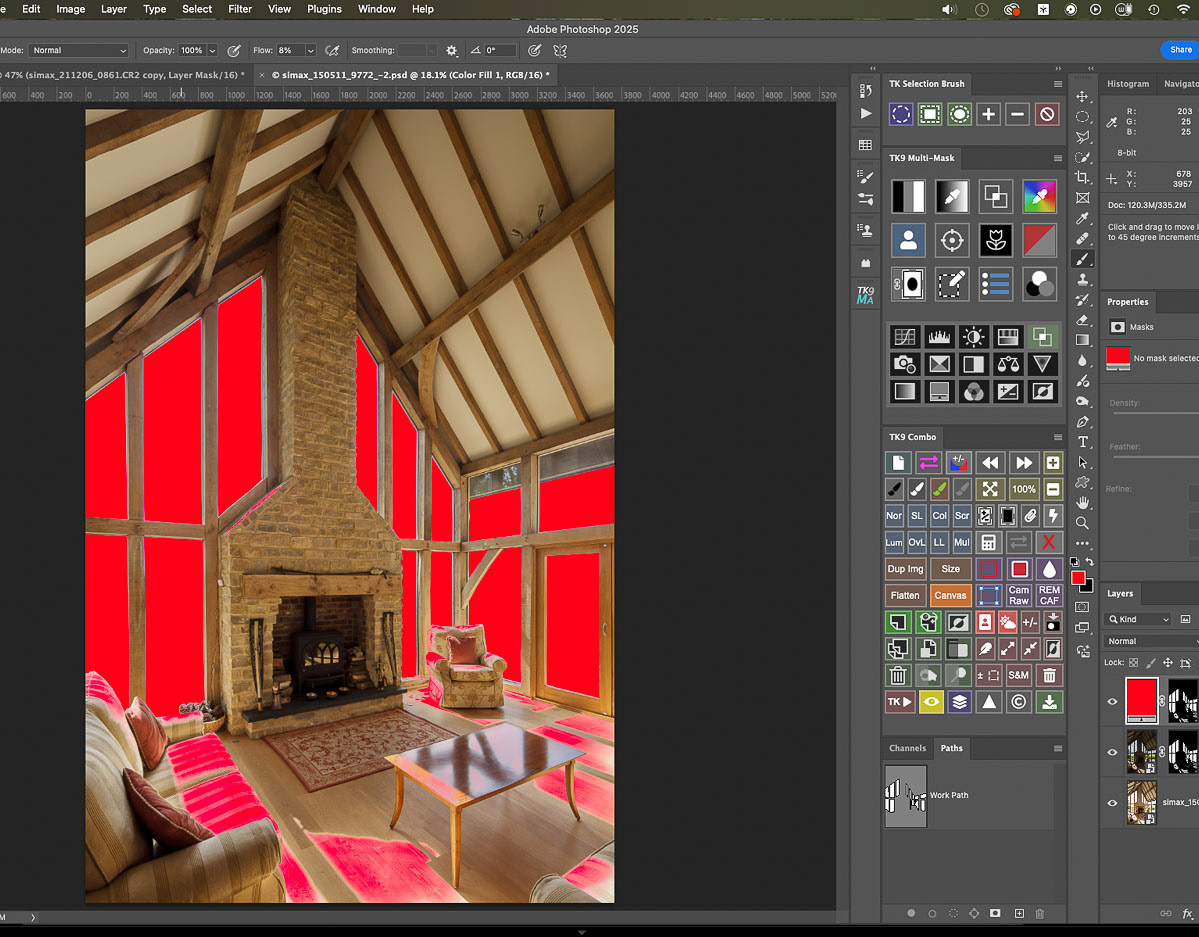
With the model layer on top, a basic selection of her is made with the quick selection brush...

And a layer mask created to enable the main room shot to show through... (the dotted line at the bottom of the frame shows the alignment adjustment made and now visible due to the mask)...

The mask alone shows the very basic and hard edged initial selection...

Using a soft-edged brush set to white, I can just brush out from the model towards the surrounding area to get a better transition between the two:

here's the refined layer mask....

It was really important that the two files were matched closely in that area so that those blurred areas around the model could be brushed in.

The result: a convincing combination of the two images. A bit of time spent matching the two files with the reference function in Lightroom made the hand blending very straightforward, especially as the model was in movement, leading to semi-transparent areas where any discrepancy in color or luminance would really have become apparent.
Got a problem image?
Or do you just prefer being behind the camera rather than chained to the computer?
If so, why not look into outsourcing your image editing and retouching?
If so, why not look into outsourcing your image editing and retouching?
Feel free to contact me at any time: I can lighten your processing load at very reasonable per image rates!